Project Profile: Book Edit and Design + Logo
A SOLDIER’S SONG
By Jason Grom
WORK SCOPE
DEVELOPMENTAL EDIT / LINE EDIT / COPY EDIT / FACT CHECK / PROOFREAD / INTERIOR FORMAT AND DESIGN / COVER FORMAT AND DESIGN / ILLUSTRATIONS / IMAGE EDITS AND CAPTIONS / GLOSSARY / IMPRINT LOGO / COVER MOCK-UP
OUTPUT
SOFTCOVER / HARDCOVER / EBOOK / LOGO / PROMOTIONAL IMAGES
OBJECTIVES
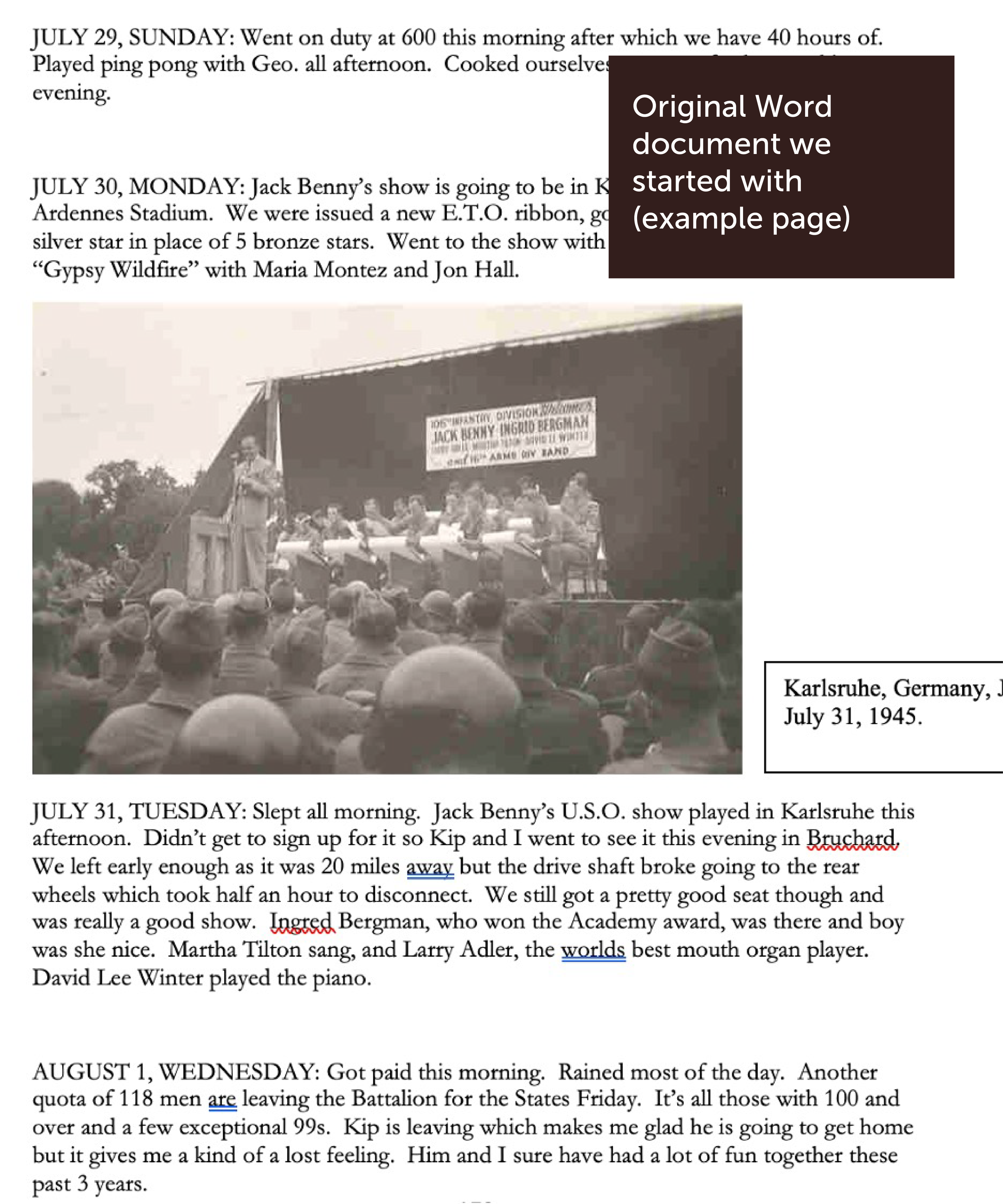
Jason was interested in self-publishing a book recalling his grandfather’s experience in the Army during World War II. Jack Anderson carried pocket-sized notebooks to record the daily happenings throughout his time overseas fighting on the Allied side of the war. Jason and family members transcribed each pocket notebook to have it in electronic format (Word document) and added some of the pictures taken by and of his grandfather. Jason wanted to take this to the next level and create a book to publish and share with the world.
SERVICES
Planning
We started with the Word document which included the transcriptions from Jack’s pocket notebooks and a preface that Jason had written along with some tributes to Jack. There were also some images embedded throughout the document. Knowing we’d want to add structure around those parts, I created a table that outlined the typical parts of a book, and we met to determine what to include. This gave us our structure and helped us track the completion status of each part. While Jason worked on writing and gathering more content for the afterword, conclusion, about the authors, chapter introductions, etc., I worked on the cover design and a layout for the interior.
Cover Design
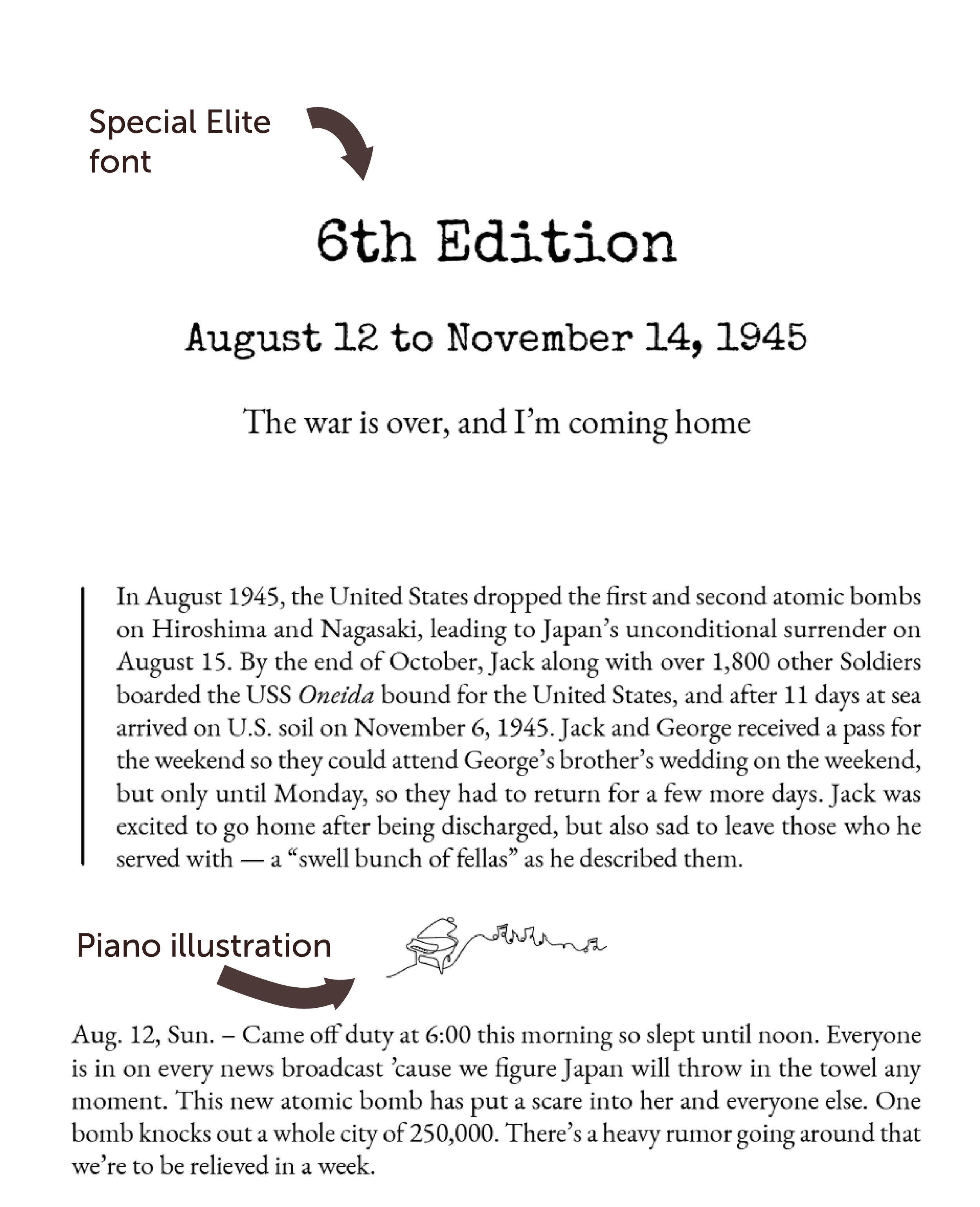
Given the theme of the book, Jason had chosen the image of Jack at a piano in an old fort in France. I worked on making Jack and the piano stand out from the rest of the photo by shadowing the surrounding area. I thought it would be cool to have the entire photo wrap around the front and back. We had already determined the font to be used for the interior of the book, but I wanted to add something that harkened back to the era as a secondary font. I landed on using Special Elite since it reminded me of the old typewriters of the day, and it has a not-so-perfect look to it. This font was used for the cover title and for chapter titles. I worked out where text would live on the front, spine, and back considering other elements like the publishing imprint and the barcode box.
Interior Design and Formatting
I wanted to ensure the diary entries were consistently formatted throughout the book, so I drafted a sample layout chapter for review. After these designs were approved, I worked on the rest of the book’s layout (headers, footers, chapter titles, paragraph styles, etc.) and began placing the content, images, and captions. Once this was ready, I added the additional parts of the book as they came to me. In some cases, I needed to decide on and set up special styles for these too.
Other ideas for the interior included some illustrations to delineate the chapter introductions by Jason from Jack’s diary entries. Using the theme of the piano, I drew a piano with song notes coming out from it. Each chapter of the story includes one of these pianos with more song notes as the story progresses.
Another design choice was to include an image of the song sheet of our national anthem. I wanted this to look weathered, so I edited a public domain image to reflect the “old” style reminiscent of the Special Elite typeface.
Publishing Imprint Logo Design
Since Jason was self-publishing this book, I offered to create a logo for him as his publishing imprint. He already had a blog focused on “learning in the flow of life,” and he gave me a photo of him as a boy on a dock at the lake for inspiration. I wanted to create something simple but reminiscent of the feeling of that photo.
I designed a logo showing a child whose attention is captured by a flying bird with a backdrop of the sun setting on flowing water. This became the logo for this book (and others he may publish in the future) and his blog.
Copyediting
I was editing while adding content during the entire project, and in the end this approach was much more time consuming. Lesson: finalize all content in Word before putting it into Adobe InDesign.
Editing ran the gamut: developmental edits, line edits, copy edits including spelling, grammar, fact checking, consistency, etc. I also researched every instance of a movie title and actors names, cities and locations, ship names, acronyms, airplanes, etc. I worked with Jason to double check names of Jack’s fellow soldiers and officers for consistency and anything that related to something historical in nature. We checked on proper military language and spelling. Where perhaps a word was left out of a sentence in the transcription, Jason would pull out the little notebook and see what was originally there. We had several long video calls to go over my questions or things I had found that needed clarification. We also made changes to image placements, and Jason had more images to add that were relevant to the story. I edited most of the images to remove borders or writing on them, straighten them, blur personal information, etc. I double checked all of the captions, wrote some when needed, and ensured they were in Jack’s voice.
In a few cases, we left spelling of certain words as is (such as “nite” instead of “night” as that was Jack’s writing style), or if a word didn’t make sense, but it was what Jack wrote, we left it alone. All of these decisions were deliberate.
As I read through the story while editing, I realized that there were a lot of things I wasn’t familiar with, such as names of airplanes, military equipment, and acronyms. I suggested that we add a glossary for readers like me. So, I began compiling information to include there.
Proofreading
It was finally time to get a proof copy of the book. Recalling where we started and how much work went into getting the book to this point in print made it so exciting to have it in hand! We received our proof copies for a final review. I made notes directly in the book as I read through each page and looked at formatting to make sure we caught everything. Jason’s mother also read through it and found some things to fix. I made all of the updates, and then created the final files for the cover and interior for Jason to submit for publishing the softcover version for the launch.
Hardcover and eBook
A quick follow-up to the softcover book launch was to create a hardcover version and an eBook. For the hardcover, I needed to change the cover size to fit a “wrap around” style and edit the interior for the ISBN information. The eBook was a much more involved process as it required creating an epub file, and you don’t always know how things will turn out from a print version to an epub. Luckily, since I had set paragraph and character styles in Adobe InDesign for the print set up, formatting in the epub was largely fine. During the first round, I was able to see where I would need to fix things to flow and break properly and how images were placed. I did a lot of version testing to get this in shape, and then replaced the table of contents from the print version with one I created for the eBook with active links. It was interesting how it would look great in Apple Books, but different through the Amazon testing software. At some point, there is nothing more to fix, and instead just a matter of how it looks and functions based on a vendor’s software. Once I had everything looking and functioning as best I could, I sent the epub file to Jason for publishing. I also created some mock-up images with the book cover to use for promotional posts.
RESULTS
Jack Anderson’s story is now out in the world for everyone to learn more about what it was like during World War II. Jason shares the story of a man who was loved by many, and I am honored that I was able to help with such an important and valuable project. I feel like I got to know Jack Anderson, and I now have a deeper understanding of the sacrifices that were made by so many in the pursuit of freedom for all.
Jason has complete publishing ownership and control over the books using his own ISBNs, he can upload the files to any seller site he wishes to, and he has control over sales and revenue.
That’s a wrap !
“Editor, designer, and consultant are words people may use to describe the services she provided, but those words don’t do justice to the immense impact she made. Amazing!”
— Jason Grom, Author of A Soldier’s Song: The World War II Diary of Sergeant Jack Anderson
LEARN MORE ABOUT JASON’S BOOK HERE


